
Mockup templates on this page are designed by Freepik
Company: Steam is a digital video game library. It is known as the ultimate destination for playing, discussing and creating games.
Role: UX/UI Designer
Tools & Skills Used: Adobe Illustrator, Adobe Photoshop, Sketch, user research, user empathy, brand building, UX & UI design
Defining the Problem
From first glance, I noticed three major pain points:
1. Lack of intuitive structure or organization. It looked less like an app and more like a compressed version of the desktop Steam website.
2. Neutral visual language. The color palette and graphics needed to be more engaging and connected to the target users' personalities and goals.
3. Misalignment between user expectations and the reality of the app. Key parts of the mobile gaming app experience were missing that target users would expect and/or enjoy. For example, once a user is logged in their account they expect to see options to scroll through such as New Releases or Now Trending, but instead they land on the Friends page, which causes confusion.
Understanding the Users
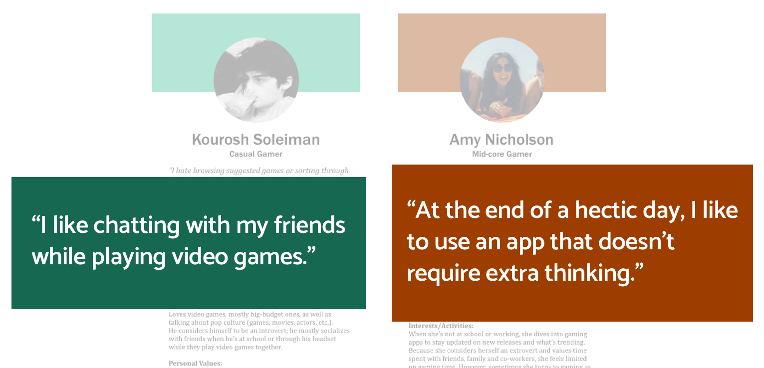
Through my user interviews and user testing, I not only learned that users of the app experienced the same above pain points, but I also learned that people who are attracted to apps like Steam have the following two common goals: socializing while playing games and discovering new titles. Users also have busy schedules and want to make the most of the little free time they have in using an app that’s effortless and stress-free.
User Personas
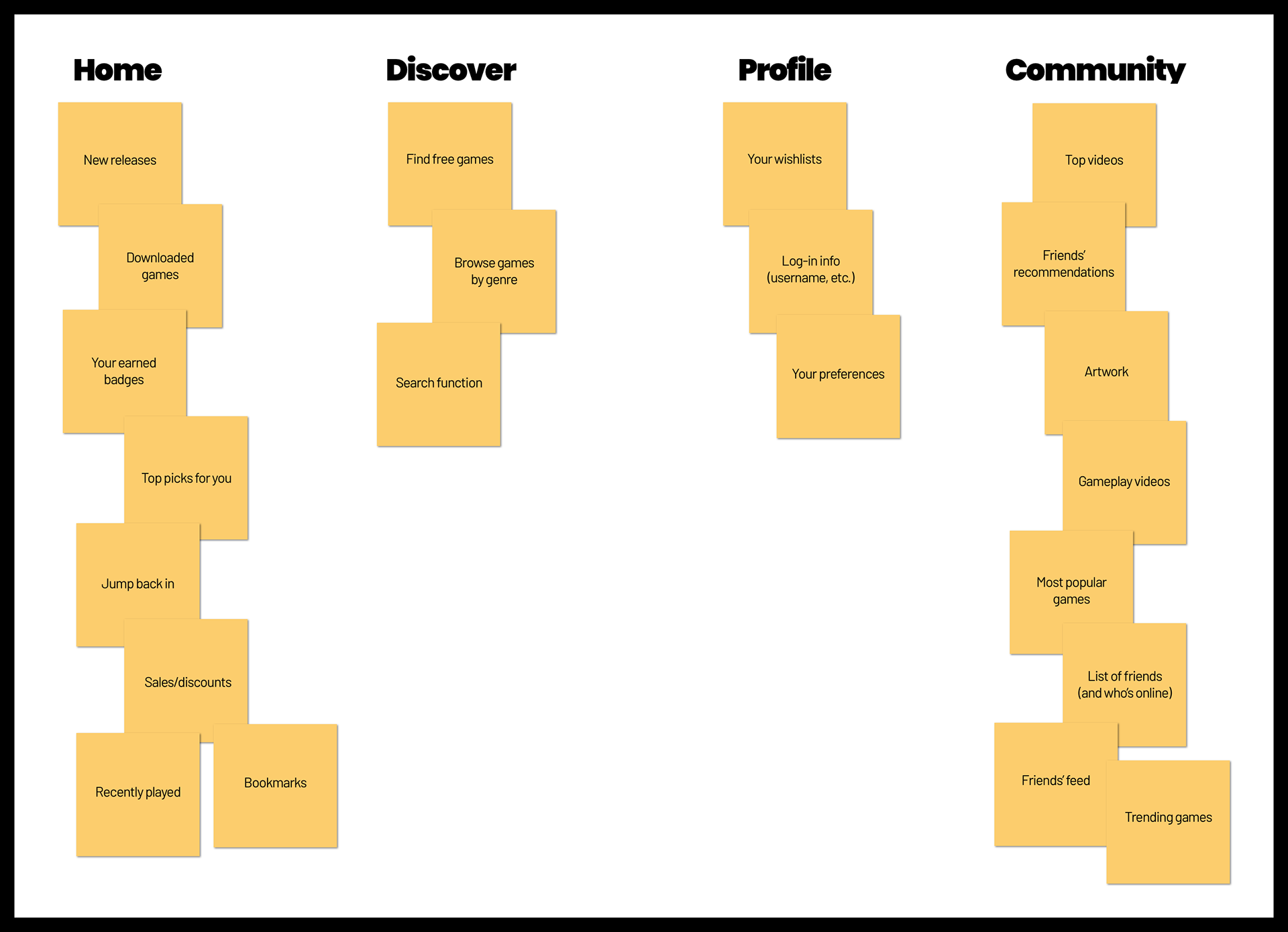
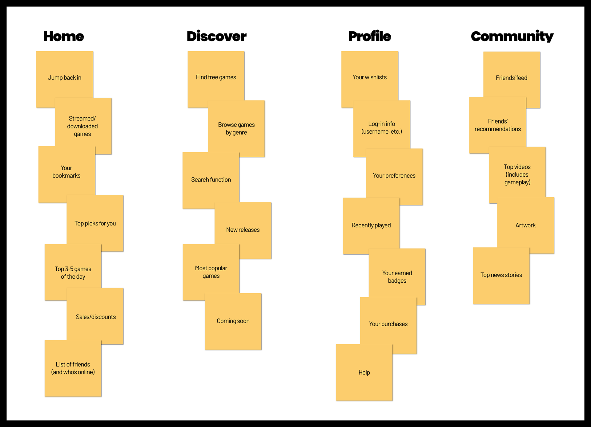
Information Architecture Development
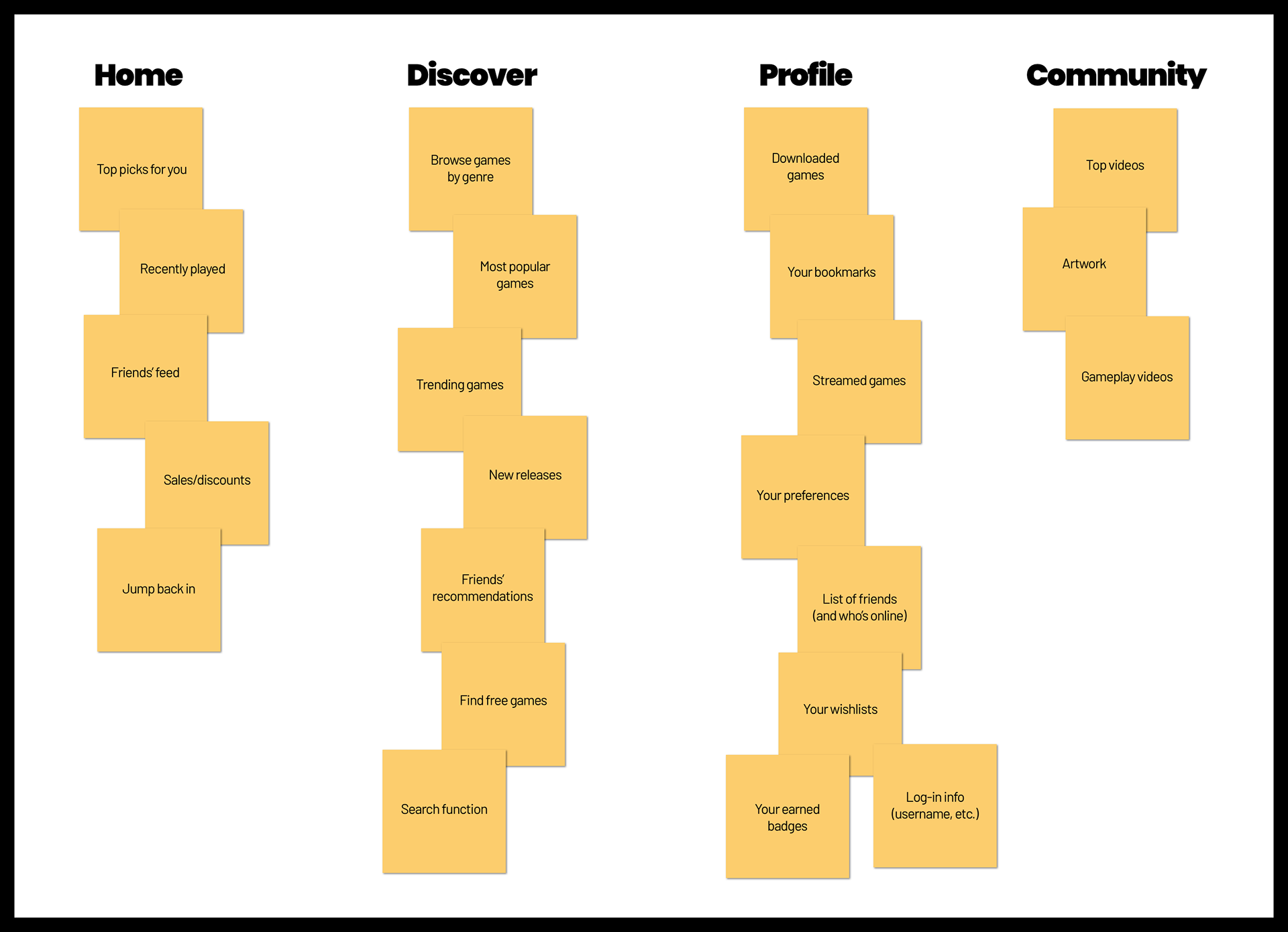
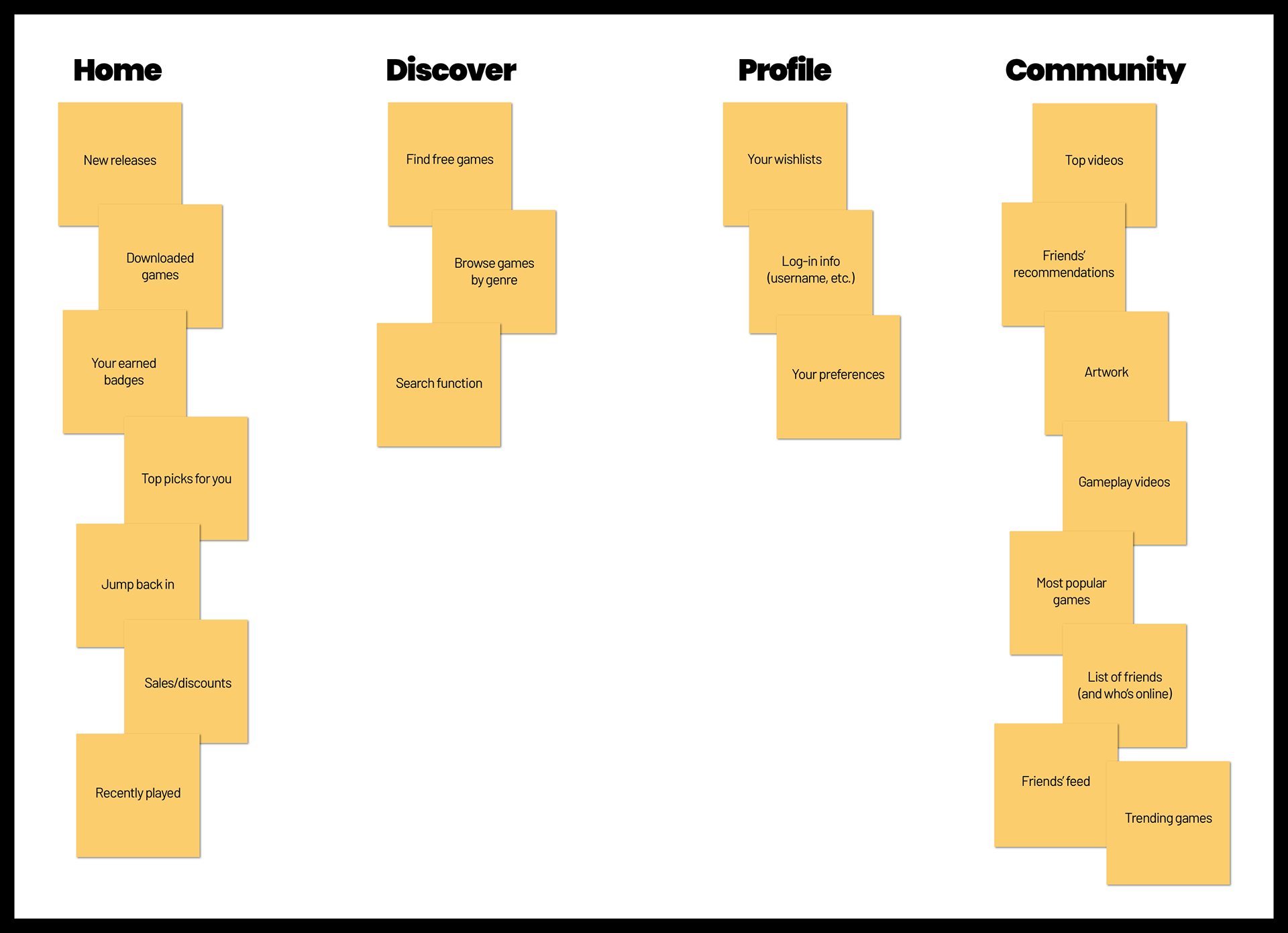
I conducted a whiteboard exercise where I wrote down everything I would imagine to be on the app and decided which section it would go under. Then, I asked two users to do the same. My conversations with the users and comparing the sets of sticky notes led me to the following conclusions about how the navigation bar should be in the app.
- Home is you-oriented.
- Discover (later changed to “Browse”) is for new suggestions.
- Profile is what you want other people to see.
- Community is for anything social-related.
- Home is you-oriented.
- Discover (later changed to “Browse”) is for new suggestions.
- Profile is what you want other people to see.
- Community is for anything social-related.
Me
User No. 1
User No. 2
Final
Goals for the New App
- Strong visual language that's in line with Steam's brand
- Make the app more social-oriented and discovery-oriented
- Make the app well-organized, engaging and intuitive
- Make the app more social-oriented and discovery-oriented
- Make the app well-organized, engaging and intuitive
More Research
Before producing the wireframes, I researched what Steam's competitors did in terms of visual branding in order to ensure that whatever design I came up with would help Steam stand out (while still being faithful to its personality). For the UX design, I studied mobile apps I found inspiring and whose features I could potentially adapt to use for Steam.
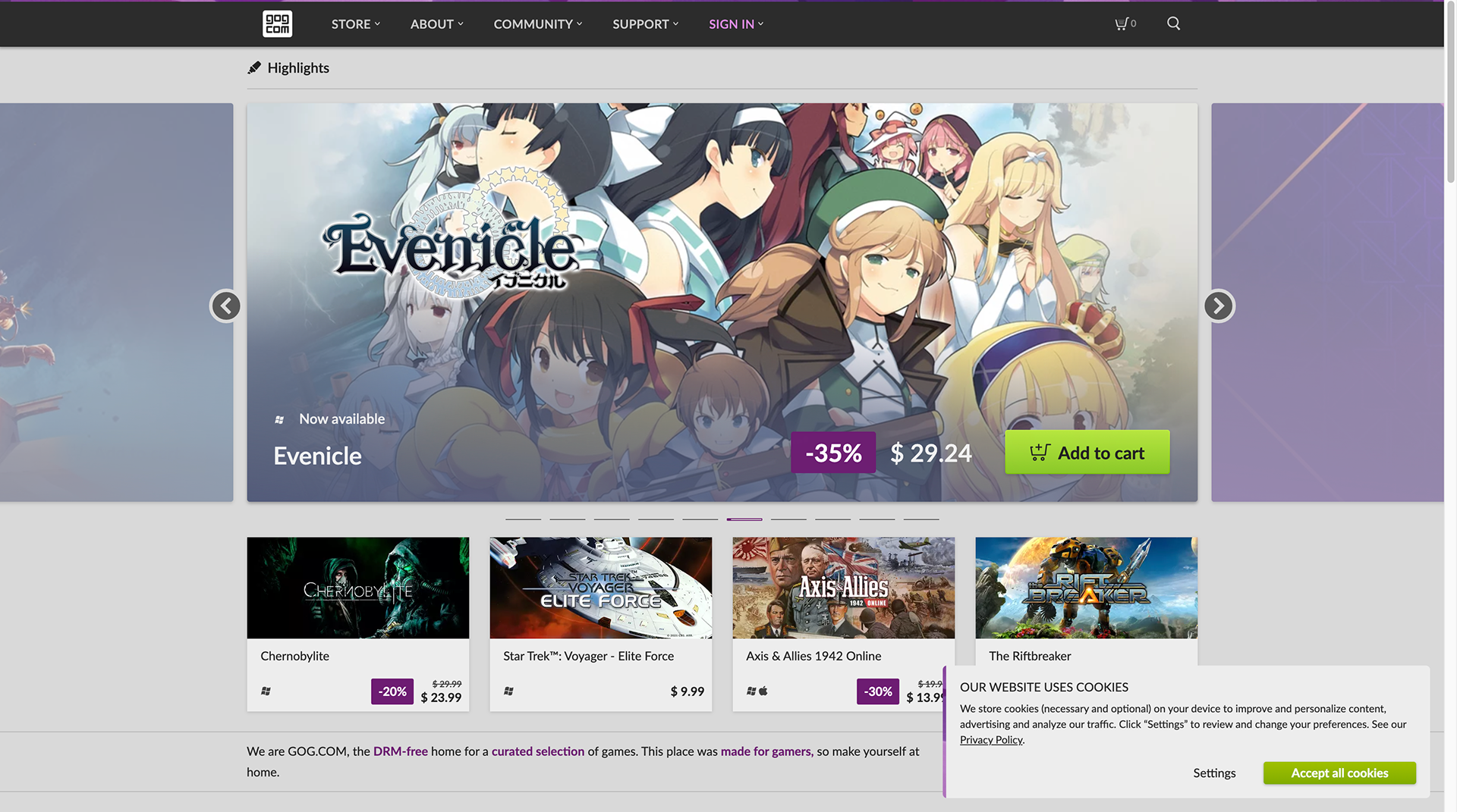
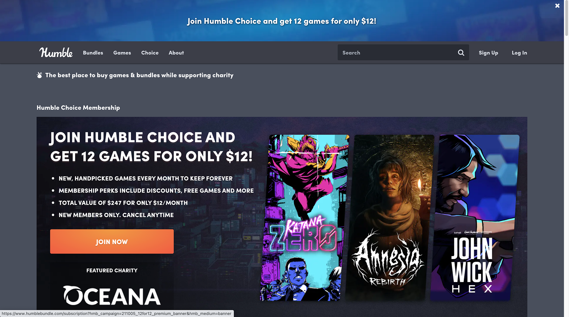
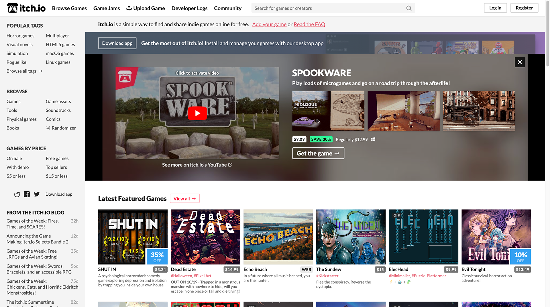
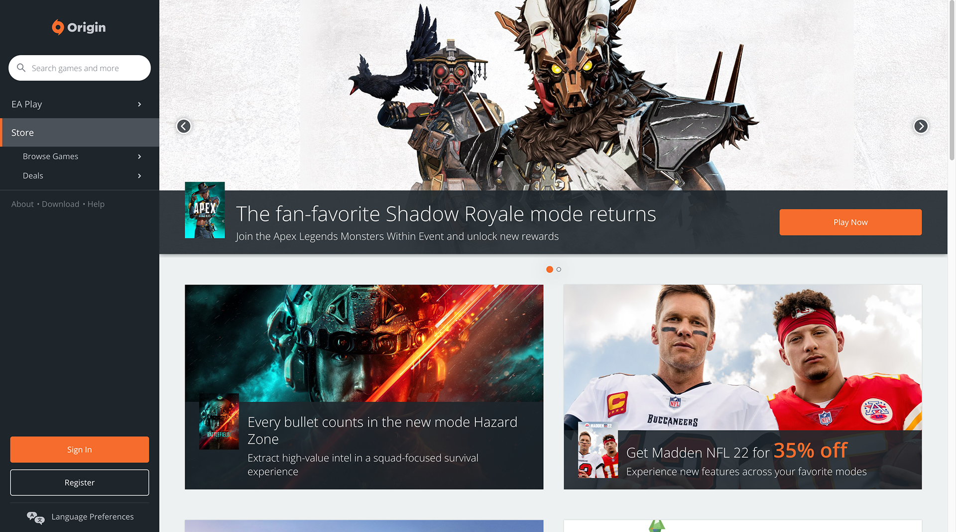
The Competitors
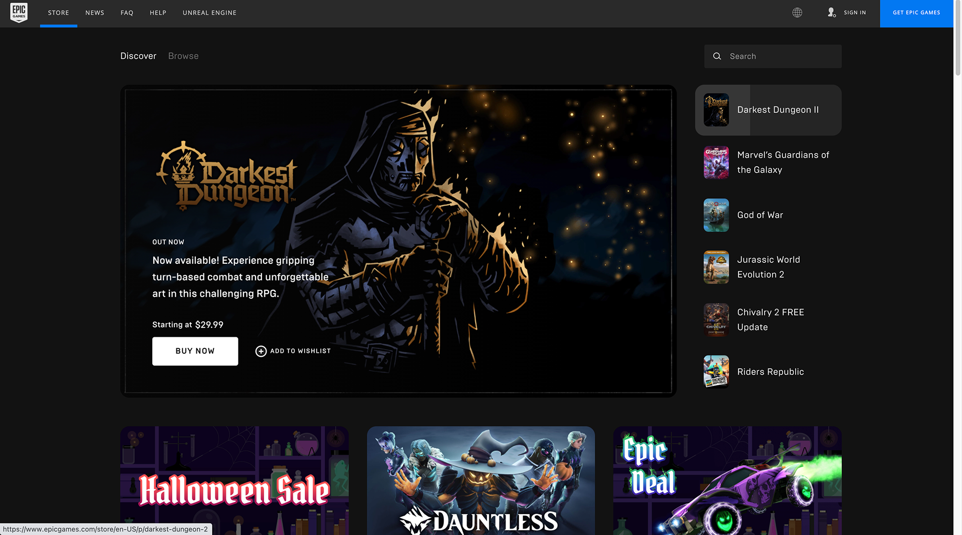
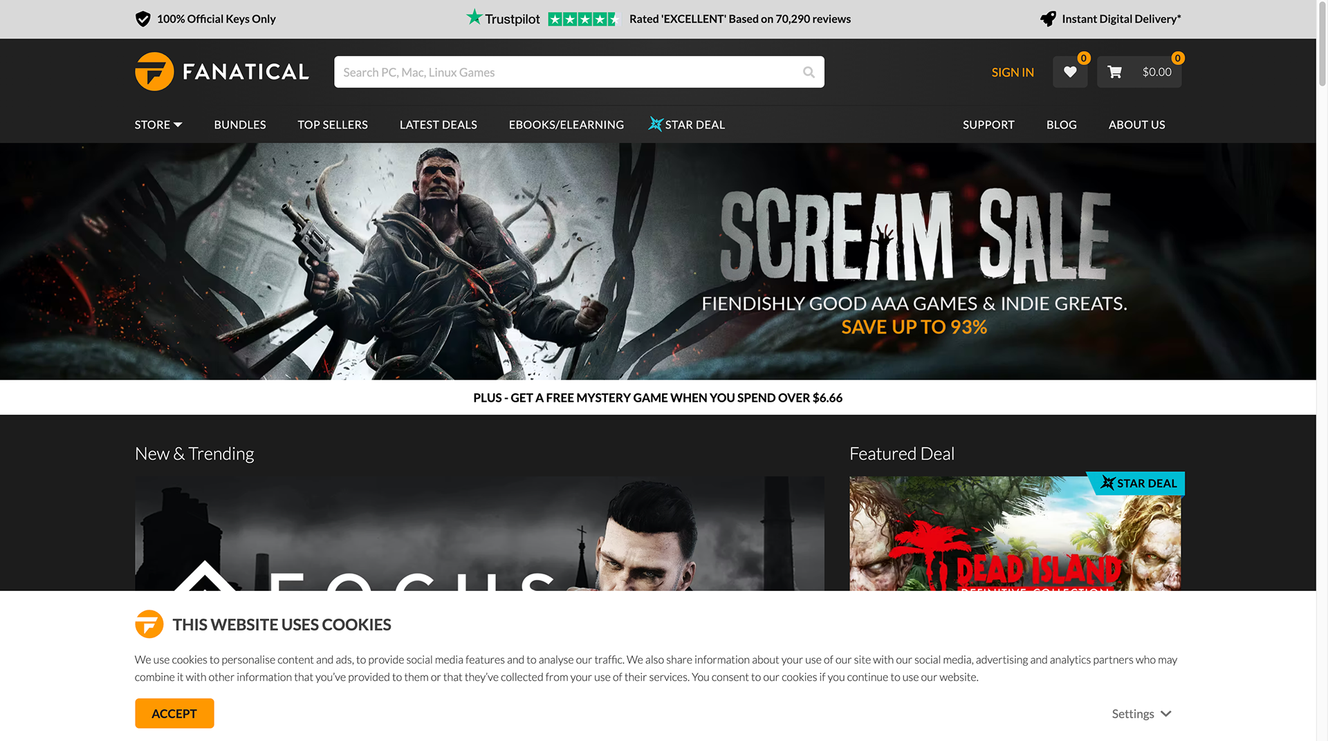
Competitors like Origin, Humble Bundle and Fanatical use bold, warm colors for their logos. And, a larger pool of competitors including the already mentioned three as well as itch.io, Epic Games and GOG.com have platforms dominated by neutral colors, specifically black and shades of gray.
For Steam, I decided to use cool colors and to consider blacks and grays more as accents than as the main color palette. Not only does this help the app stand out from its competitors, but it also helps create the relaxed, playful atmosphere Steam users expect.
Doses of Inspiration
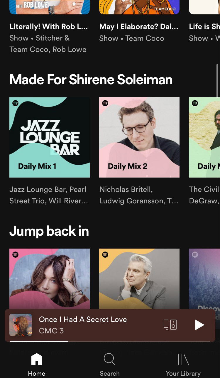
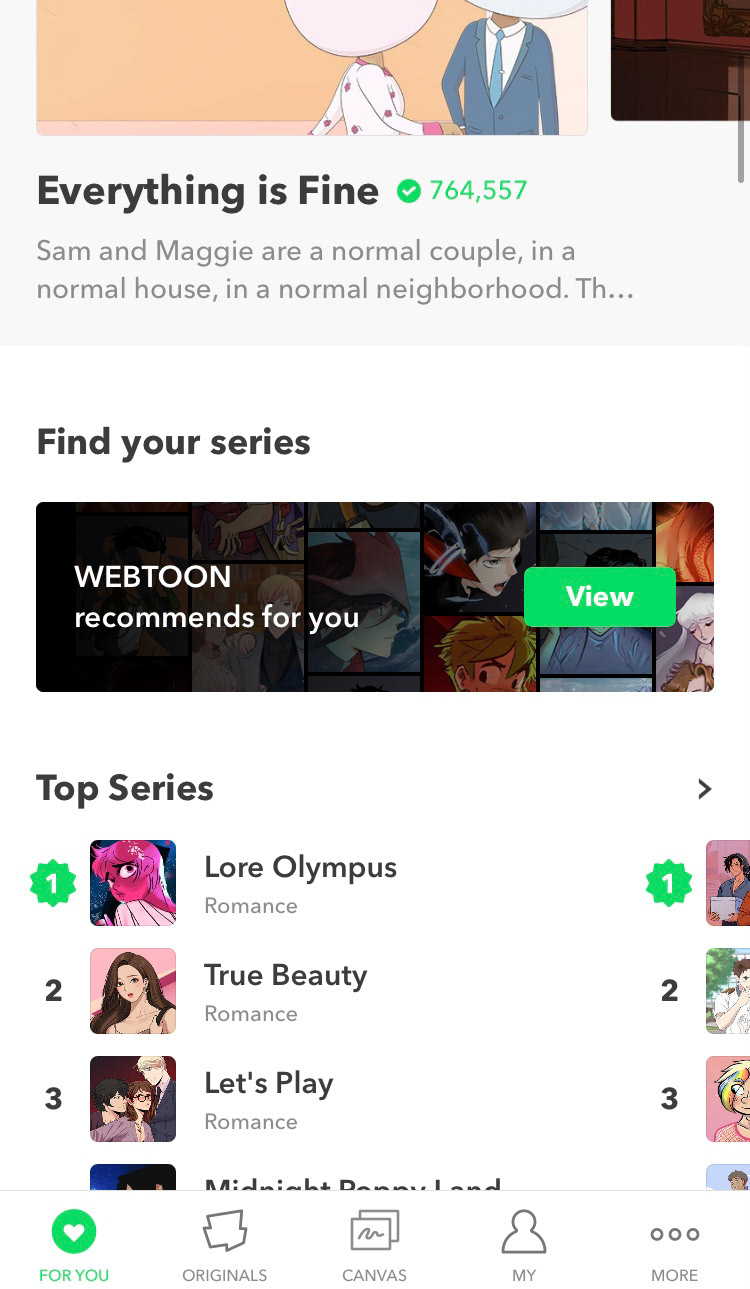
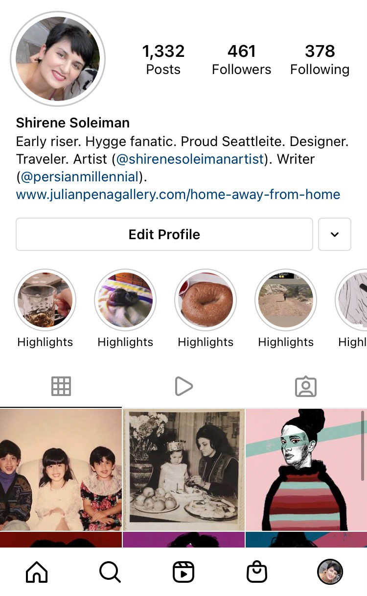
I studied Spotify, WEBTOON and Instagram as their audiences overlap with Steam's, specifically in that all the users expect easy, straightforward interactions and to have engaging experiences. I also learned users like these apps because they are personalized, which is a design trend in 2021.
In the three apps, the user can quickly and easily achieve any major task, find new titles and find themselves in a discovery-type mindset. This can be incorporated for the Steam app not just by introducing the user to new games but also by encouraging the user to physically go through the swipe motions rather than interact with the app passively (by just pressing on a button, etc.).
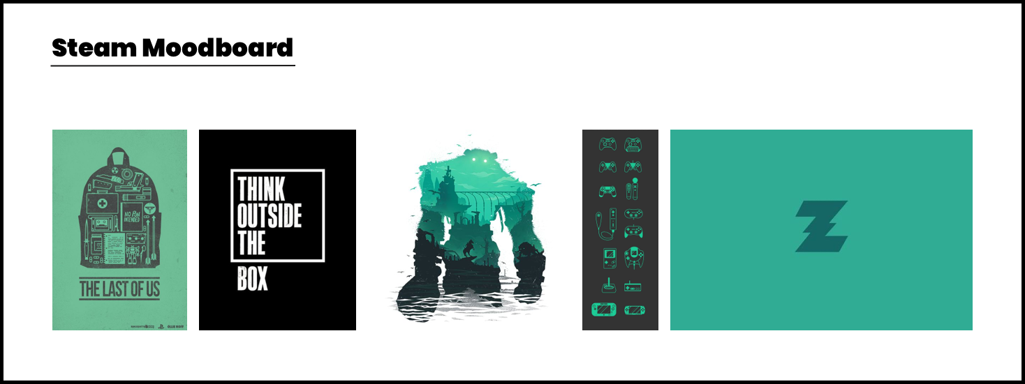
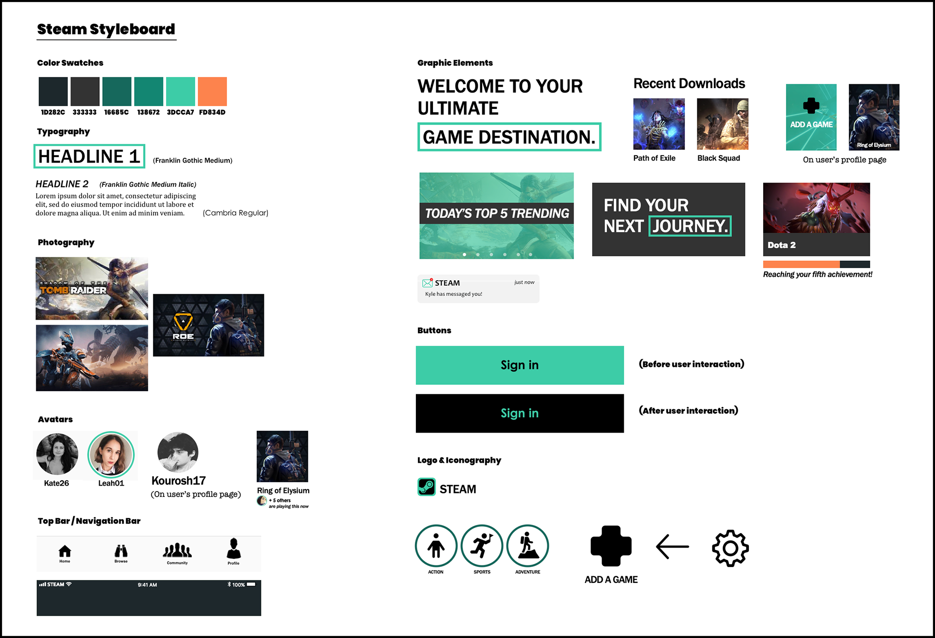
The Visual Revamp
I wanted to use typography that was bold and straightforward as well as a cool-tone, youthful color palette that established a calm, stress-free environment where the user is relaxed and can explore, discover and play games with a clear head. I also wanted to keep in mind the goal of maintaining a discovery mindset.
My keywords for the moodboard and styleboard were:
Intimate
Relationship-oriented
Discovery
Ease of use
Straightforward
Relationship-oriented
Discovery
Ease of use
Straightforward
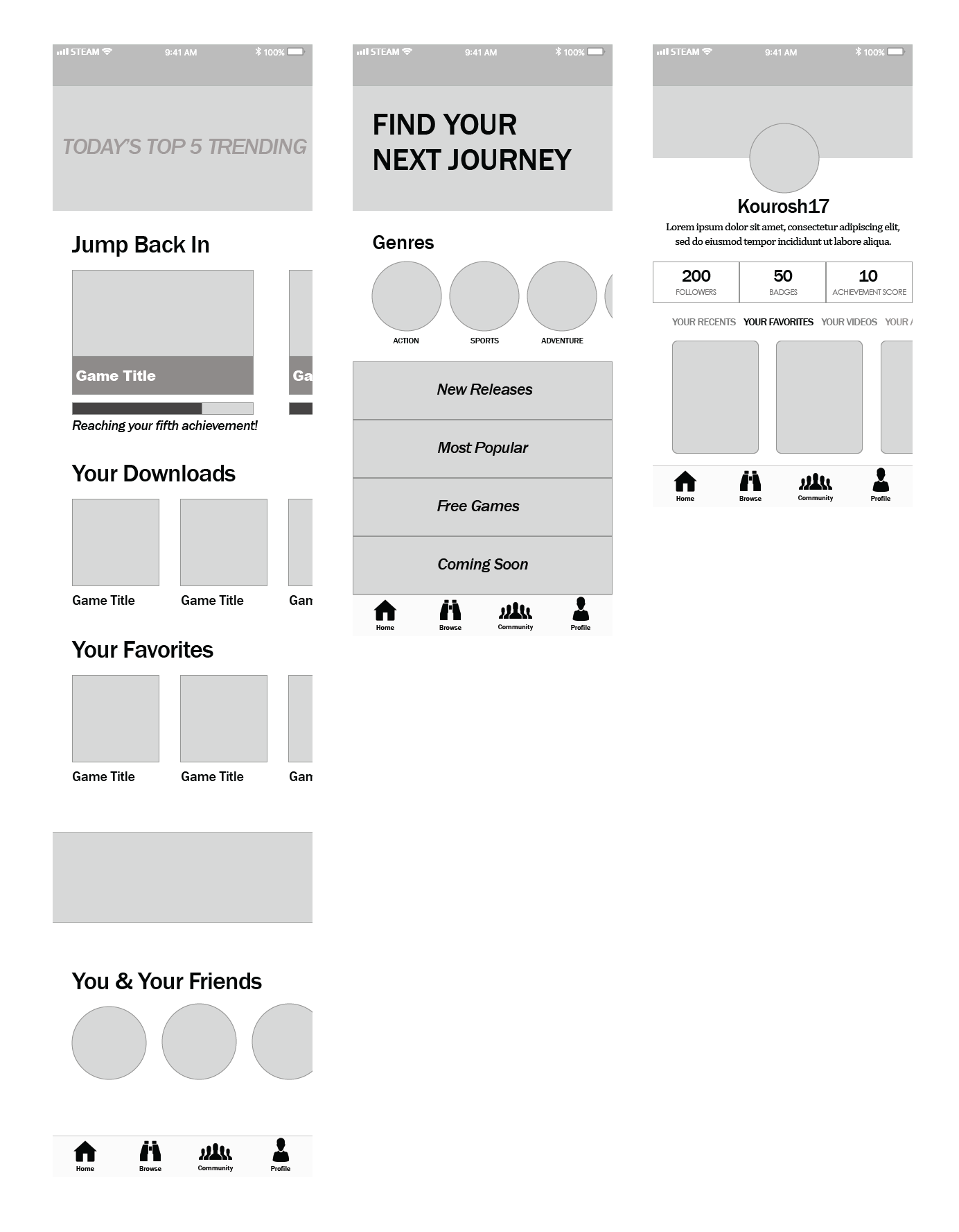
The Wireframes
The Redesign
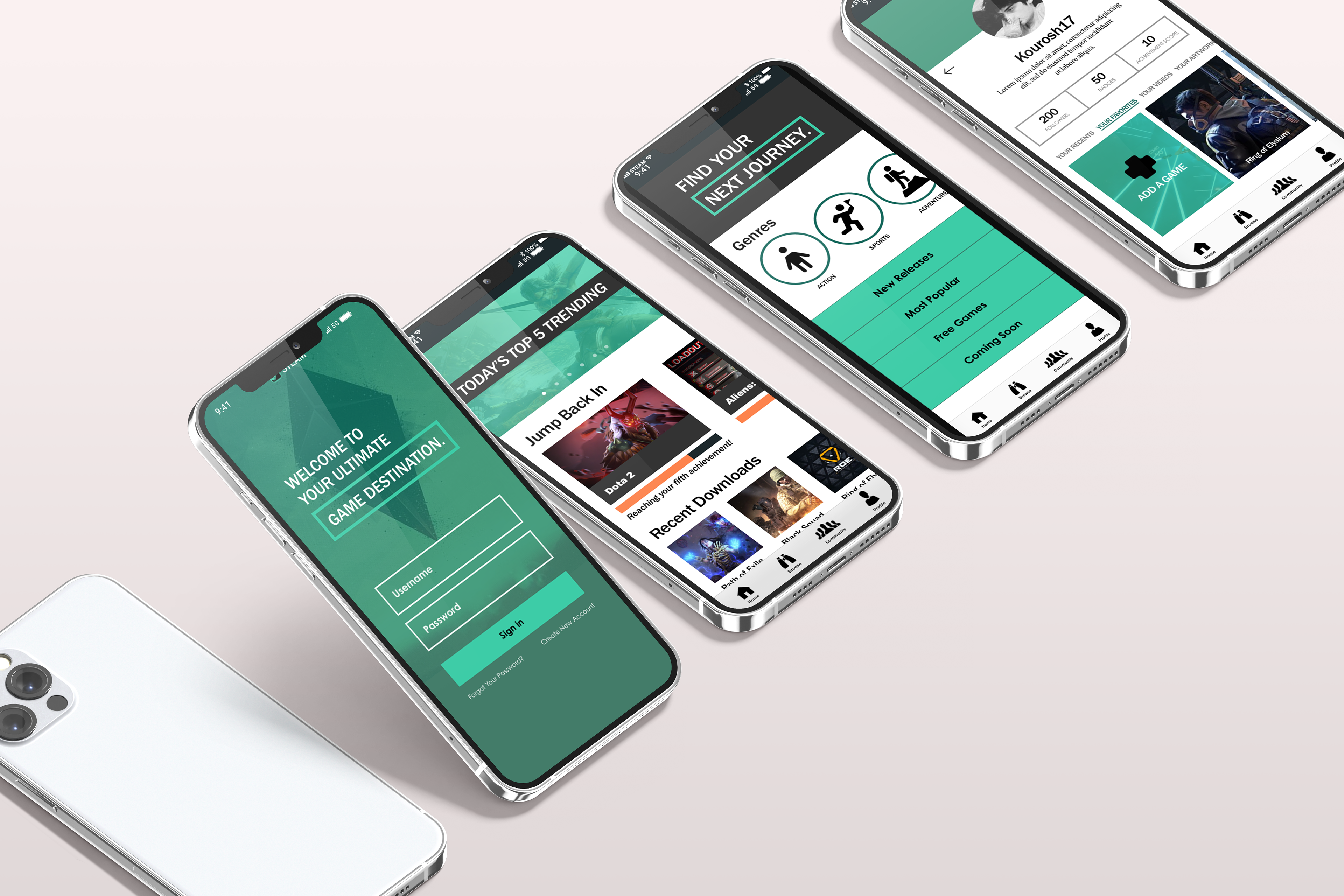
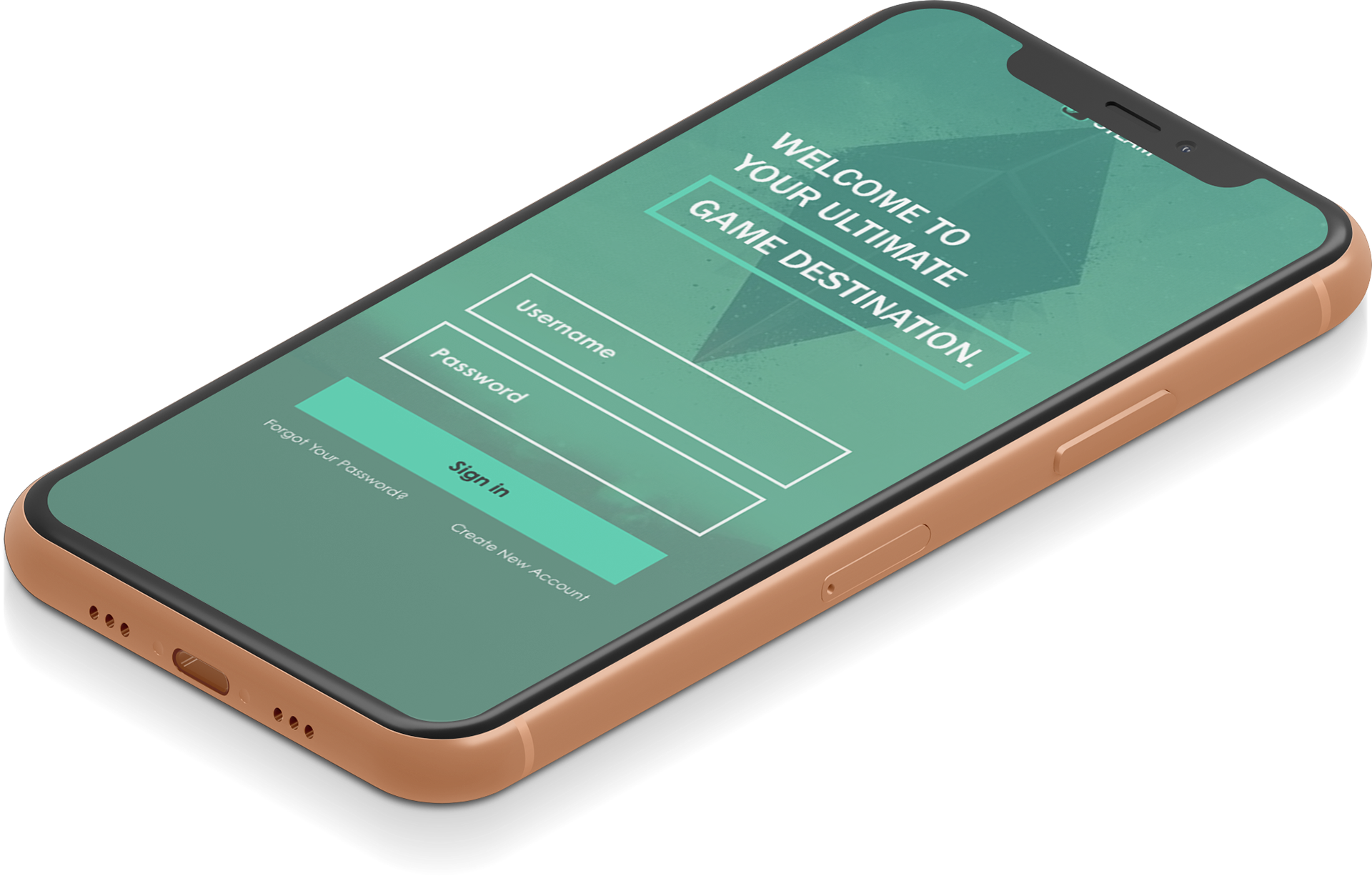
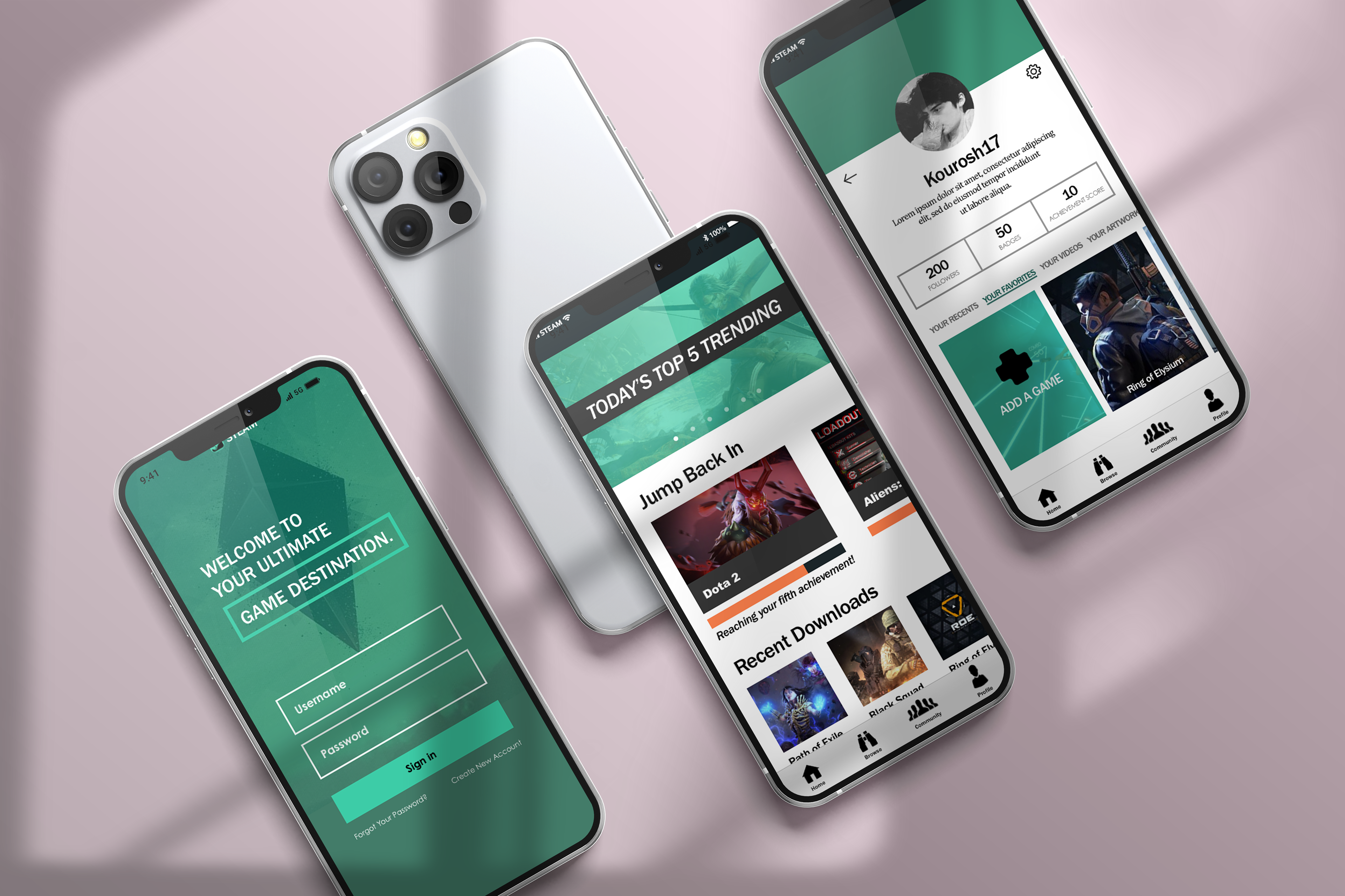
The log-in page on the original Steam app only gave users the option to sign into existing accounts. Now, for those who don’t have Steam accounts, there is the option to create a new one.
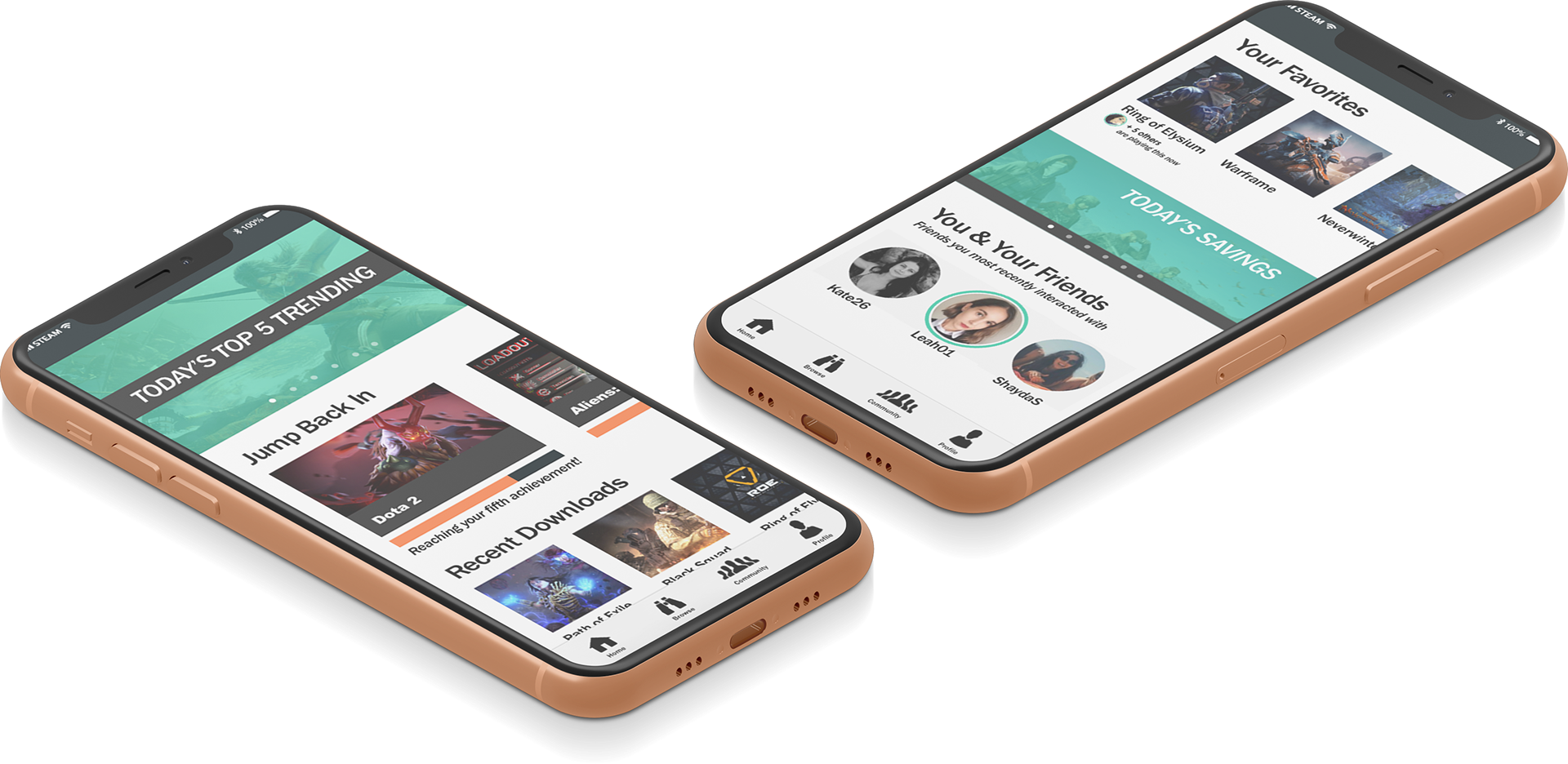
A straightforward, personalized layout gives the user a positive experience. Also, the use of intimate photography encourages the user to be immersed in what should be an easy-flowing, relaxing session of gaming. In addition, one of the pain points I had read online was about Steam's achievements system; specifically, the achievements were not collected in one place as the user had to search for them, and achievements were displayed as a string of boxes and text rather than having points or scores attached to them. Therefore, I included an achievements progress bar on the above Home page as well as an achievements score on the Profile page (see below).
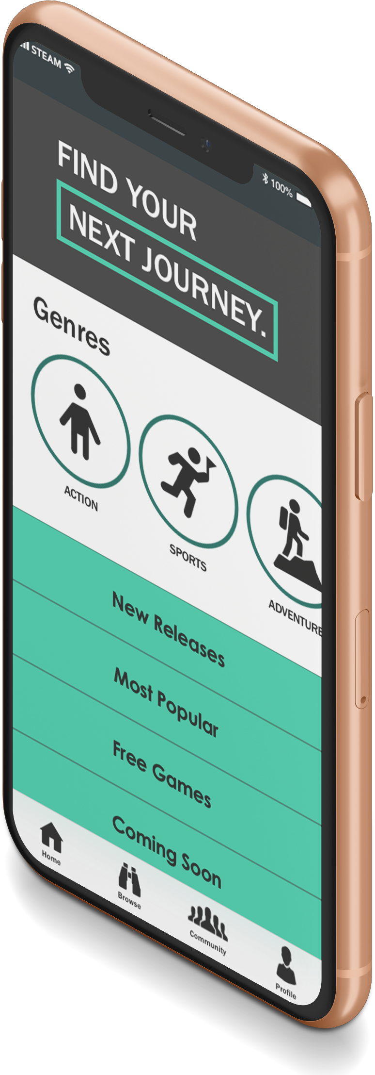
One of my goals for the app was getting the user to engage and
actively participate and discover while using the app -- physically
going through the swiping motion in the Genres section instead of
just scrolling and passively looking at all the options.
actively participate and discover while using the app -- physically
going through the swiping motion in the Genres section instead of
just scrolling and passively looking at all the options.
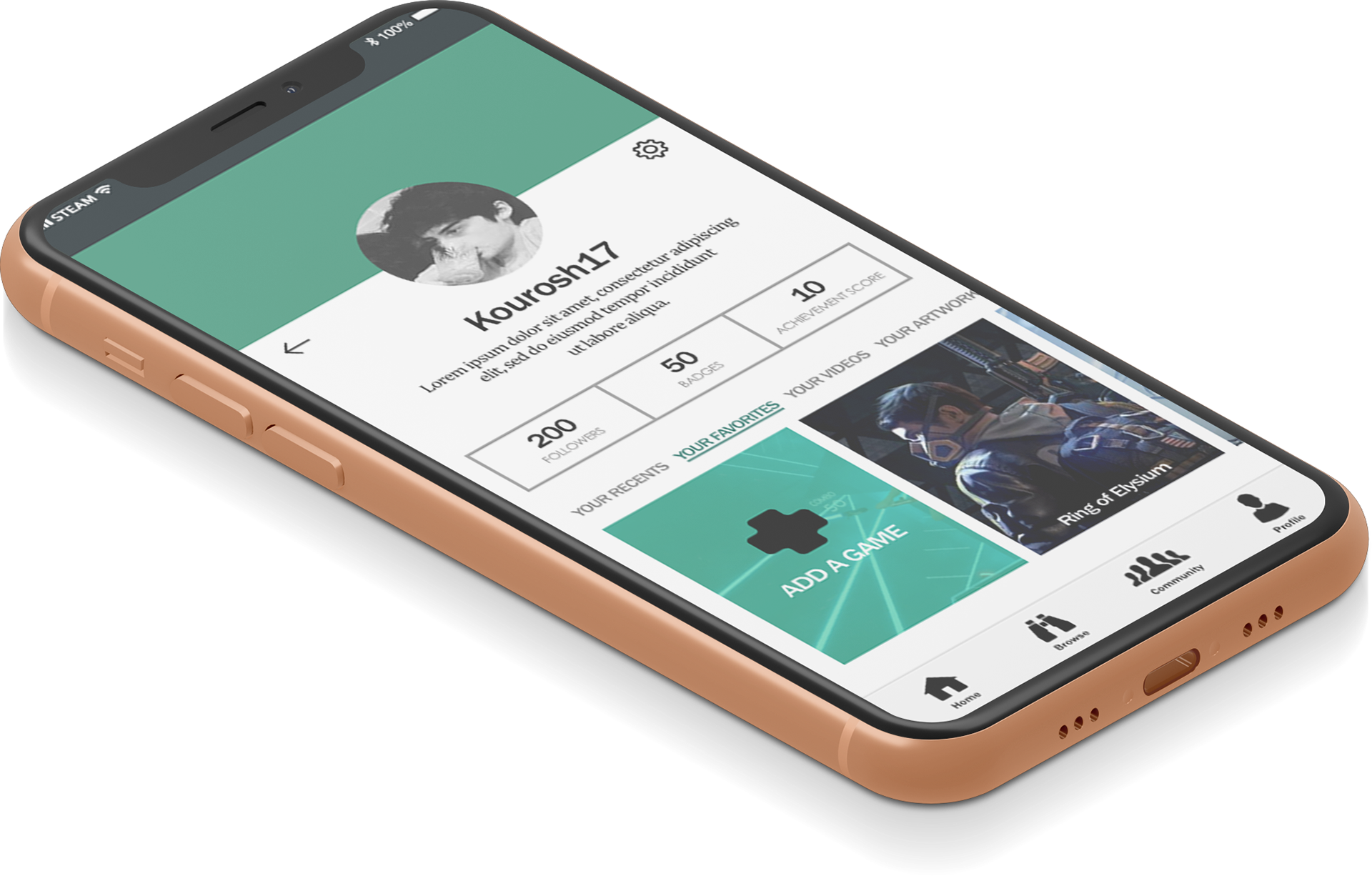
I added the achievements score to this page to keep it personalized and easy for the user.
Closing Thoughts
As this was a class assignment, I did not have a chance to implement my design in building a prototype. However, I received positive and insightful feedback from my peers and teacher as well as from the panelists who reviewed my work during a presentation.
If I had more time on this project, one of my next steps would be to create a dark mode version of the app. Dark mode is something that's trending in the design world, and it seems like a suitable addition to an app like Steam where many people will want to enjoy gaming for long periods of time without having to deal with eye strain.